
We are Official Certified bubble.io & flutterflow App Development partner


Ever opened a website on your laptop and thought, "wow, this looks great" and then opened the exact same site on your phone, only to find the menu cut off, the buttons stacked on top of each other, and text spilling off the edge of the screen? You end up pinching, zooming, and scrolling sideways just to read a single paragraph.
That frustration is exactly what your users feel when your app isn't built to adapt. And here's the maddening part: on your screen, in your design tool, everything looks perfect. The problem only shows up the moment someone opens your app on a different device a smaller phone, an old tablet, a giant desktop monitor. And obviously, you can't ship your laptop to every single user just so they see the "correct" version of your app.
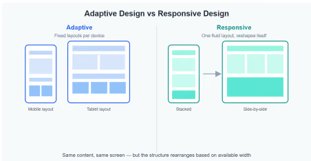
So how do you actually fix this? There are two main strategies: adaptive design and responsive design.
● Adaptive design means building a handful of fixed layouts one tailored for mobile, one for tablet, one for desktop and showing the right one depending on the device.
● Responsive design means building a single, fluid layout that automatically reshapes, resizes, and rearranges itself to fit whatever screen it lands on.
Both approaches have their place, but for most apps especially the ones you're building in FlutterFlow responsive design is the more practical, maintainable, and future-proof choice. You build it once, and it just works, whether someone opens it on an iPhone SE or a 27-inch monitor.
The good news? FlutterFlow gives you a surprisingly powerful toolkit for this, and once you understand how the pieces fit together, designing responsively becomes second nature. Let's walk through it step by step.
Why FlutterFlow Makes Responsive Design Easier
If you've ever written responsive layouts in raw Flutter code, you know it usually means juggling MediaQuery, LayoutBuilder, and a pile of conditional widgets. FlutterFlow takes most of that complexity and turns it into visual settings you can tweak directly on the canvas sliders, dropdowns, and toggles instead of nested code.
The catch is that these tools are scattered across different panels, and if you don't know they exist, it's easy to build a layout that "just happens to work" on your screen and falls apart everywhere else. So let's go through the features that actually matter.
1. Understand FlutterFlow's Breakpoints
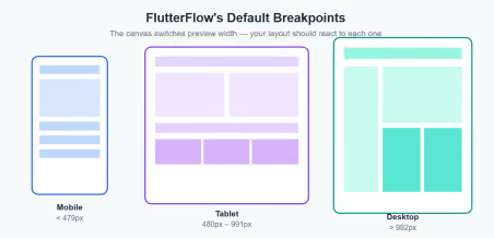
Every responsive layout starts with breakpoints the screen widths at which your design needs to change. FlutterFlow's canvas lets you preview your app at different widths, roughly grouped into Mobile, Tablet, and Desktop.
The point of switching between these previews isn't just to "check how it looks." It's to actively design for each one. As you resize the canvas, watch what breaks: text that wraps awkwardly, buttons that get squeezed, images that overflow their containers. Every one of those issues is a clue about which widget needs a more flexible setting.
A good habit: after building a section of your UI on the default (usually mobile) view, immediately drag the canvas wider and see what happens. Fix it right then, while the context is fresh in your mind don't leave it for "later," because later you'll have forgotten exactly how that section was structured.
2. Get Comfortable with Width and Height Settings
This is the single biggest factor in whether your design holds up. In FlutterFlow, every widget has width and height settings, and you generally have three options:
Fixed value (e.g., 300px) the widget stays exactly that size no matter what. Great for icons, avatars, and small UI elements that shouldn't change. Terrible for containers, cards, or anything that needs to fill available space.
Infinity the widget expands to fill all the space its parent gives it. This is your best friend for responsive layouts. A container set to width: infinity inside a full-width parent will automatically stretch on a desktop and shrink on a phone, without you touching a single setting.
Percentage-based sizing useful when you want a widget to take up, say, 50% of its parent's width regardless of the actual pixel value. This is perfect for things like a sidebar that should always be one-third of the screen.
The rule of thumb: avoid fixed pixel widths for anything that holds content. Reserve fixed sizing for small, decorative elements icons, dividers, fixed-size buttons. Everything else should be set to fill, expand, or scale.
3. Row, Column, and the Power of Expanded
FlutterFlow's layout is built on Rows (horizontal) and Columns (vertical), just like Flutter itself. The problem most beginners run into is placing several widgets in a Row with fixed widths it looks fine on a wide screen, but on a narrower one, the row simply runs out of space and either overflows or gets cut off.
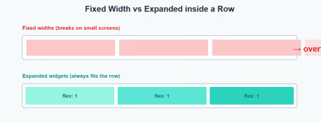
The fix is the Expanded widget (and its more flexible cousin, Flexible). Wrapping each child of a Row in an Expanded widget tells FlutterFlow: "share the available horizontal space proportionally between these elements." Now, instead of fighting for fixed space, your three cards, columns, or buttons will always divide up whatever width is available whether that's 360px or 1600px.
A few practical tips:
● If you want elements to keep equal widths on any screen, wrap each in Expanded with the same flex value (the default, 1, works fine).
● If one element should be wider than another (say, a 2:1 ratio), give it a higher flex value.
● For elements that should keep their natural size and let only one sibling grow, wrap just that one sibling in Expanded and leave the others as they are.
And for cases where items should wrap onto a new line instead of squeezing think tags, chips, or a gallery of small cards use a Wrap widget instead of a Row. It behaves like a Row until it runs out of space, then automatically continues on the next line.
4. Alignment: MainAxis and CrossAxis
Every Row and Column in FlutterFlow has two alignment properties: main axis alignment (the direction the Row/Column flows) and cross axis alignment (the perpendicular direction).
For a Row, the main axis is horizontal and the cross axis is vertical. For a Column, it's the opposite. Setting these correctly is what keeps your content centered, evenly spaced, or properly aligned regardless of how much extra space appears on a larger screen.
A common beginner mistake is leaving everything at the default alignment and then trying to "nudge" elements into place with padding. This works on one screen size and breaks on another. Instead, think in terms of intent: do you want this content centered on the page? Spread evenly? Aligned to one side? Set the alignment property to match that intent, and it'll hold up across every screen width automatically.
5. Responsive Visibility: Show and Hide Per Device
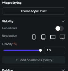
Sometimes the cleanest solution isn't to resize a widget it's to show a completely different widget depending on the device. FlutterFlow has a built-in Responsive Visibility setting (found in the widget's properties panel, usually under "Visibility") that lets you specify whether a widget should be visible on Mobile, Tablet, and/or Desktop.
This is incredibly useful for things like:
● A hamburger menu icon that appears only on mobile, while a full horizontal nav bar shows on desktop.
● A sidebar that's hidden on phones but always visible on tablets and desktops.
● A simplified "mobile card" layout versus a richer "desktop table" layout for the same data.
The trick is to design both versions as separate widgets, place them in the same spot, and use Responsive Visibility to toggle between them. From the user's perspective, it just looks like the app intelligently rearranges itself because, well, it does.
6. Conditional Values Based on Screen Width
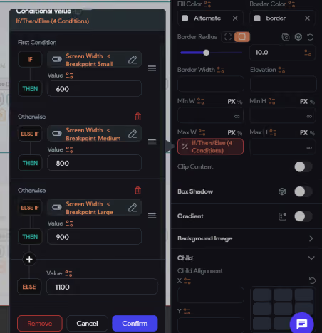
For more fine-grained control, FlutterFlow lets you set certain properties like padding, font size, or even widget visibility using conditional logic tied to the screen's width. Under the hood, this taps into the same concept as MediaQuery.of(context).size.width in Flutter code, but exposed through FlutterFlow's visual "Set from Variable" and conditional value builders.
For example, you might set a container's horizontal padding to 16px when the screen width is below 600px, and 64px when it's above that. Or you might make a font size slightly larger on bigger screens so your headings don't look tiny on a desktop monitor.
This feature is powerful, but use it sparingly. If you find yourself adding conditional values to every property on every widget, that's usually a sign your underlying layout structure (Rows, Columns, Expanded, percentages) isn't doing enough of the work. Reach for conditional values as a finishing touch, not as your primary responsive
strategy.
7. Responsive Grids and Lists
If your app displays a collection of items products, posts, photos a Grid View is often the right choice, and FlutterFlow lets you control the number of columns. The key responsive move here is to change the column count based on screen width: maybe 2 columns on mobile, 3 on tablet, and 4 or 5 on desktop.
You can wire this up using the same conditional logic from the previous section, tying the column count to the screen width. The result is a gallery or product grid that feels intentional at every size, instead of either too cramped on phones or awkwardly sparse on large monitors.
8. Padding, Margins, and Spacing That Scale
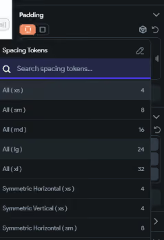
Spacing is one of those details that seems minor until your design is viewed on a 6-inch phone and a 24-inch monitor side by side. Generous padding that looks elegant on desktop can eat up half the screen on mobile, while tight spacing that feels clean on mobile can look cramped and unfinished on a large display.
A practical approach: define your spacing in relative terms rather than copying the same fixed value everywhere. Many designers set a smaller base padding (say 12–16px) for mobile layouts and scale it up for tablet and desktop, either through conditional values or by simply designing each breakpoint's layout with its own appropriate spacing. The goal isn't "the same number everywhere" it's "the same
feeling of balance everywhere."
9. Stack, Align, and SafeArea for the Edge Cases A few extra tools round out your responsive toolkit:
Stack and Align let you layer widgets on top of each other and position them relative to the edges or center of their parent useful for things like badges on top of images, floating action buttons, or overlay text on a banner. Because Align positions things proportionally, these overlays stay correctly placed no matter the screen size.
SafeArea automatically adds padding to avoid notches, status bars, and home indicators on phones with unusual screen shapes. It's a small thing, but skipping it is one of the most common reasons a layout looks perfect in the FlutterFlow preview and slightly broken on an actual device.
Best Practices for Responsive Design in FlutterFlow Pulling everything together, here's a checklist worth keeping next to your canvas:
● Design mobile-first, then stretch. It's much easier to expand a mobile layout for larger screens than to compress a desktop layout down to a phone. ● Avoid fixed widths on containers, cards, and content blocks. Reserve fixed sizing for icons and small, decorative elements.
● Wrap Row children in Expanded or Flexible whenever they need to share space proportionally.
● Use Wrap instead of Row for collections of items that should flow onto new lines.
● Set alignment based on intent, not by eyeballing one screen size. ● Use Responsive Visibility for structural changes (different navigation patterns, different layouts), not just cosmetic tweaks.
● Use conditional values sparingly, as fine-tuning rather than your core strategy.
● Test at every breakpoint, every time you add a new section don't wait until the end of the project to check.
● Don't forget SafeArea, especially for screens with app bars, bottom navigation, or full-bleed images.
Common Mistakes to Avoid
A few patterns tend to trip up almost everyone early on. The first is building an entire page on the mobile preview, switching to desktop only at the very end, and discovering that half the layout needs to be restructured rather than just resized. The second is using fixed pixel widths "just to get it looking right for now" and then forgetting to revisit them these are the silent culprits behind overflow errors on smaller screens. And the third is over-relying on padding and margins to fix alignment issues that should really be solved with proper main axis and cross axis alignment settings.
None of these are hard to fix once you know what to look for which is really the whole point of understanding how FlutterFlow's responsive tools work in the first place.
Wrapping Up
Responsive design in FlutterFlow isn't about memorizing a long list of settings it's about building a habit. Every time you add a widget, ask yourself: what happens to this on a much smaller screen? On a much larger one? Does it need to expand, shrink, hide, rearrange, or stay exactly as it is?
Once that question becomes automatic, you'll find that FlutterFlow's breakpoints, Expanded widgets, alignment properties, Responsive Visibility, and conditional values stop feeling like separate tools and start feeling like one cohesive system.
And your users whether they're on a five-year-old phone or a brand-new tablet will get an app that simply fits, without ever knowing how much thought went into making that happen.
.svg)
.svg)


.avif)
