


Understanding the Concepts of All FlutterFlow UI Widgets
A beginner-friendly guide for students learning FlutterFlow UI development
What Are Widgets in FlutterFlow?
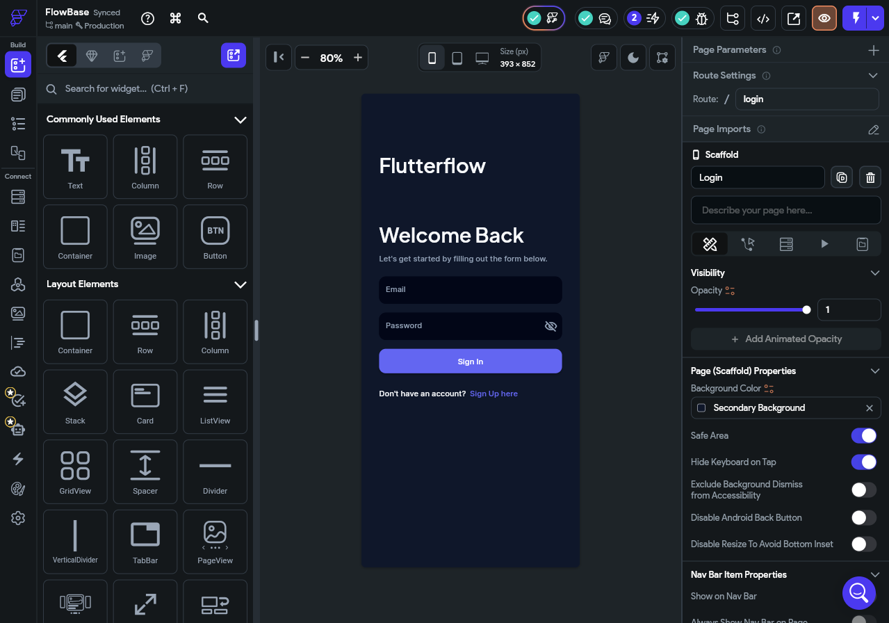
Widgets are the building blocks of your app's user interface in FlutterFlow. Every visual element you see in an app a button, a block of text, an image, even the blank space between two items is a widget.
Think of widgets like puzzle pieces. Each piece has its own shape and purpose. On their own, they look simple, but when you combine them thoughtfully, you can build anything from a basic login screen to a full-featured social media feed.
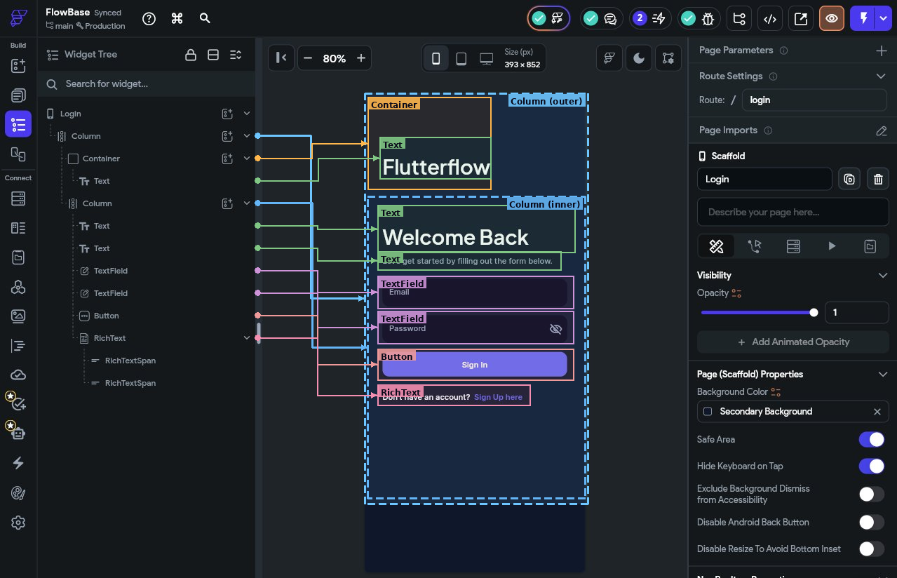
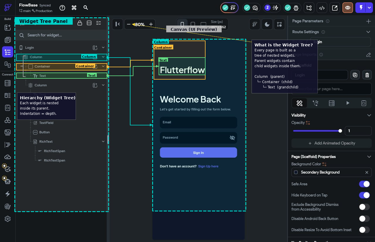
In FlutterFlow, you build your app's UI by dragging widgets onto a canvas and configuring them through a panel — no code required for most tasks. Widgets are nested inside each other to form a tree structure. Understanding this tree is one of the most important concepts for a beginner.
Why Widgets Matter in FlutterFlow?
Understanding widgets is essential because they are the only way to build a user interface in FlutterFlow. There is no alternative — every screen, every layout, and every interactive element is a widget. The moment you open a new page in FlutterFlow, you are already working with widgets: the page itself, its scaffold, and its background are all widget components.
Widgets also give you precise control over how your app looks and behaves. Instead of writing code to position an element or change its colour, you select the right widget and configure it visually. This is what makes FlutterFlow accessible to beginners — the complexity of Flutter’s widget system is presented as a simple drag-and-drop panel.
Finally, widgets are composable — you build complex interfaces by combining simple ones. A login screen is not one large thing; it is a Column widget containing Text widgets, TextField widgets, and a Button widget, each doing its own small job. Once you understand how individual widgets work, you can combine them in countless ways to build any interface you can imagine.
How Widgets Are Organized in FlutterFlow
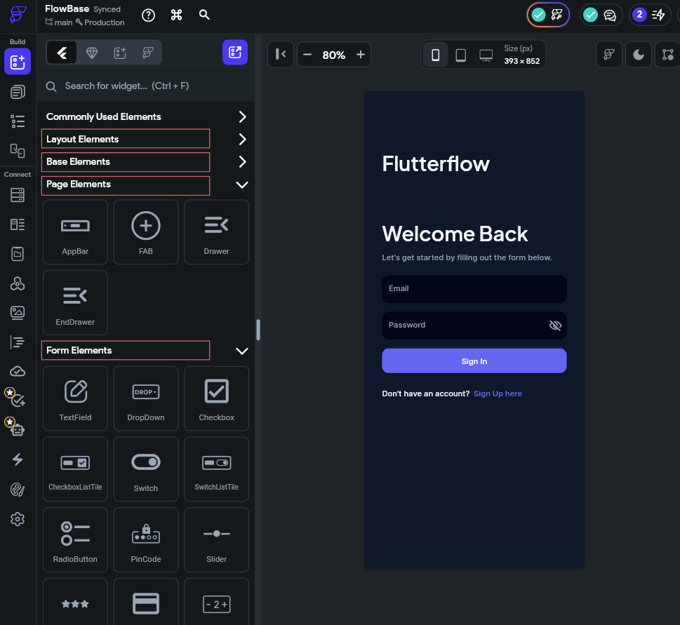
FlutterFlow groups its widgets into four main categories shown in the widget panel:
- Layout Elements — Control how widgets are arranged on screen.
- Base Elements — The core visual and interactive building blocks.
- Page Elements — Structural components that frame a page (app bar, drawer, etc.).
- Form Elements — Widgets that collect input from users.
Category 1: Layout Elements
Layout elements are not visible on their own. You will not see a "Column" drawn on the screen you will see the widgets it contains, arranged according to the Column's rules. Think of layout widgets as invisible frames or organisers.
📝 Note
A useful mental model: if Base Elements are the furniture in a room, Layout Elements are the room itself the walls, floors, and shelves that determine where everything sits.
Row
A Row arranges its child widgets horizontally, side by side, from left to right.
When to use it: Any time you want two or more elements placed next to each other. For example, a profile picture and a username displayed side by side, or a row of icon buttons at the bottom of a card.
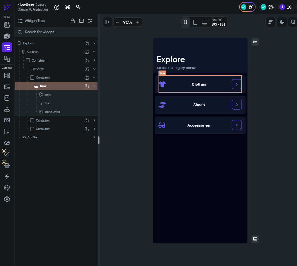
Row — Key Properties
Main Axis Alignment: Controls how children are spaced horizontally. Options include Start, Center, End, Space Between, Space Around, and Space Evenly.
Cross Axis Alignment: Controls how children align along the vertical axis (top, center, or bottom).
Children: The list of widgets placed inside the Row. A Row can hold any number of children.
Column
A Column arranges its child widgets vertically, stacked one on top of another from top to bottom. It is the most commonly used layout widget in FlutterFlow.
When to use it: For almost every standard page layout. Login screens, profile pages, and settings screens are almost always built with a Column at their core.
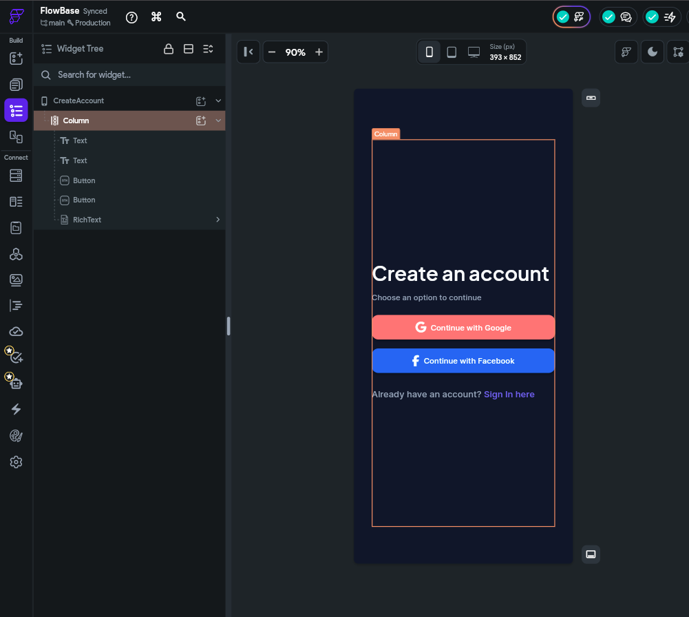
Column — Key Properties
Main Axis Alignment: Controls vertical spacing — Start, Center, End, Space Between, Space Around, Space Evenly.
Cross Axis Alignment: Controls horizontal alignment — Start (left), Center, End (right), Stretch.
Main Axis Size: Set to 'Max' so the column takes up all available vertical space, or 'Min' to shrink-wrap its children.
Stack
A Stack layers its child widgets on top of each other, like a stack of papers on a desk. Unlike Row and Column, Stack children occupy the same space — they overlap.
When to use it: When you want to place text over an image, add a badge to a profile picture, or build any design where elements visually overlap.
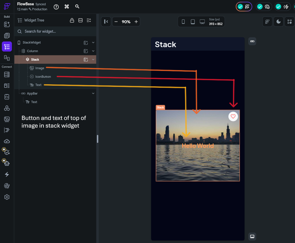
Stack — Key Properties
Alignment: Controls where un-positioned children sit within the Stack. Default is top-left.
Fit: 'Loose' lets children be their natural size. 'Expand' forces all children to fill the Stack.
Positioned children: Use the 'Positioned' wrapper on a child to place it at an exact offset from any edge of the Stack.
Container
Container is the most versatile widget in FlutterFlow. It wraps a single child widget and gives you full control over its visual appearance: padding, margins, borders, border-radius, shadows, and background colour.
When to use it: Whenever you need to style an element — add a background colour, round its corners, add a border, or control the space around it. Containers are the go-to for building cards, chips, badges, and styled boxes.
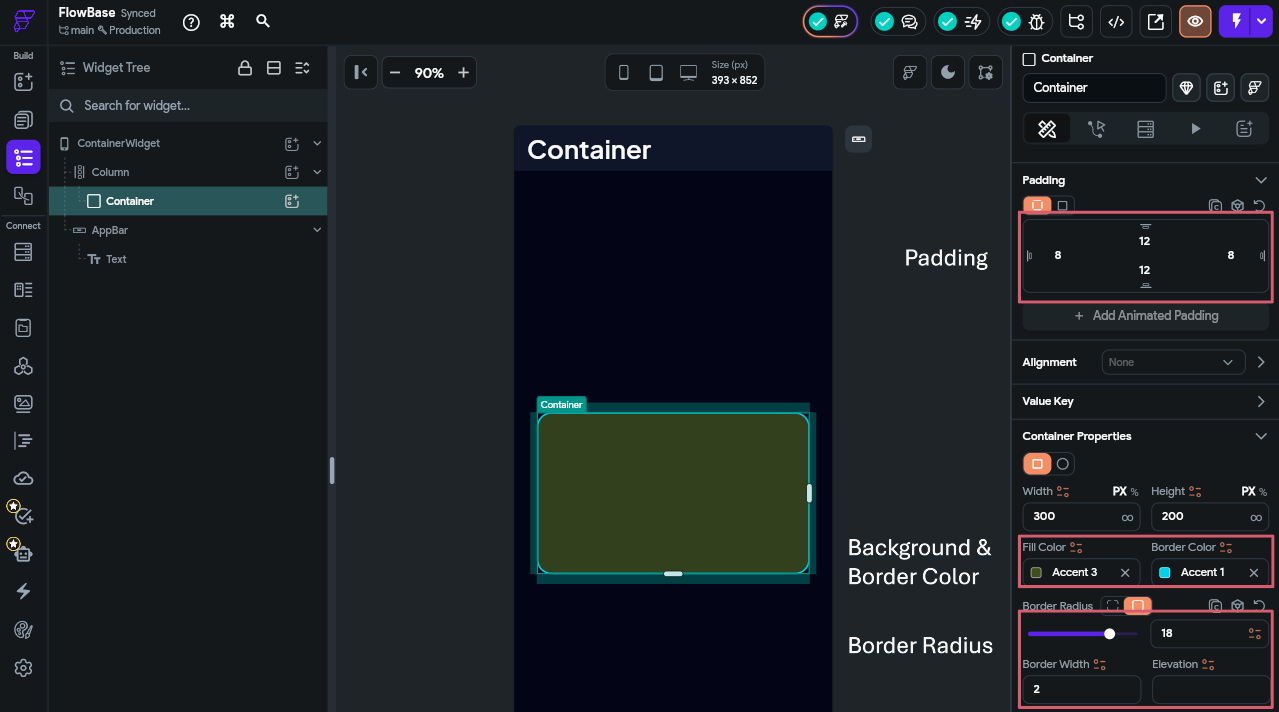
Container — Key Properties
Width / Height: Set to a fixed pixel value, a percentage of the parent, or 'infinity' to fill all available space.
Padding: Space inside the container between its edges and its child.
Background Color: Solid colour or gradient fill.
Border: Width, colour, and style of the outline.
Border Radius: Rounds the corners. Set all corners equally or control each individually.
Box Shadow: Adds a drop shadow — set colour, spread, blur, and offset.
Child: The single widget placed inside the Container.
ListView
ListView creates a scrollable list of widgets arranged vertically (or horizontally). Unlike a Column, ListView automatically handles overflow — when content is taller than the screen, the user can scroll.
When to use it: Any time you display a list of items that might exceed the screen height — news feeds, product lists, chat messages, or settings menus.
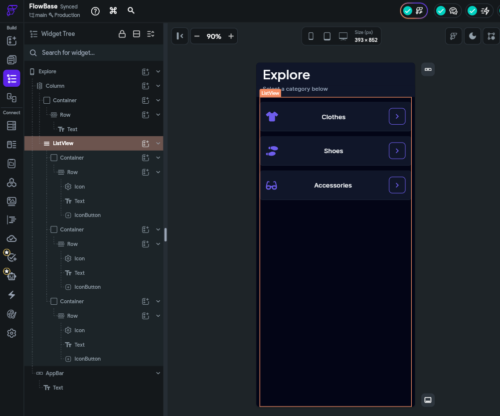
ListView — Key Properties
Axis: Vertical (default) or Horizontal scrolling.
Shrink Wrap: When enabled, the ListView takes up only as much space as its children need instead of expanding to fill the screen.
Children: The list of widgets to display. In FlutterFlow you often connect a ListView to a data source (like a Firestore collection) to generate children dynamically.
Item Builder: For dynamic lists driven by data — FlutterFlow generates one child widget per data record.
GridView
GridView arranges widgets in a two-dimensional grid — rows and columns simultaneously. It is also scrollable.
When to use it: Photo galleries, product grids, emoji pickers, or any layout where items share equal space in a grid.
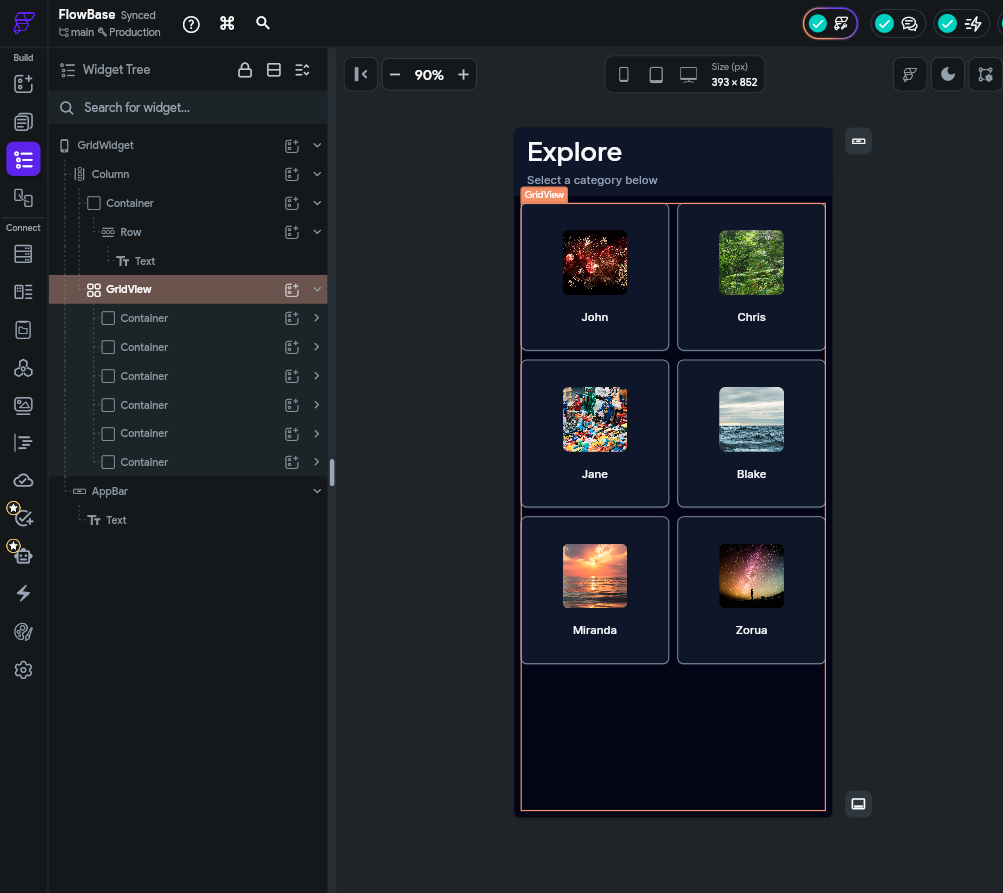
GridView — Key Properties
Cross Axis Count: The fixed number of columns (e.g. 2 for a 2-column grid).
Main Axis Spacing: Vertical gap between grid rows.
Cross Axis Spacing: Horizontal gap between grid columns.
Child Aspect Ratio: Controls the width-to-height ratio of each cell.
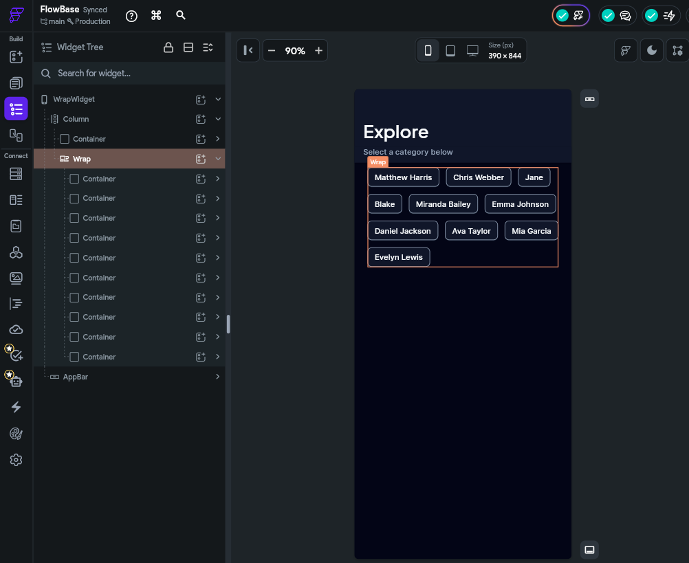
Wrap
Wrap is similar to a Row, but instead of overflowing when children run out of horizontal space, it automatically moves children onto the next line — like how text wraps in a paragraph.
When to use it: Tag clouds, filter chip groups, collections of badge-style items where the number of items is dynamic.
Category 2: Base Elements
Base elements are the visible, interactive building blocks of your app. While layout widgets arrange things, base elements are the things being arranged. These are the widgets your users will actually see and interact with.
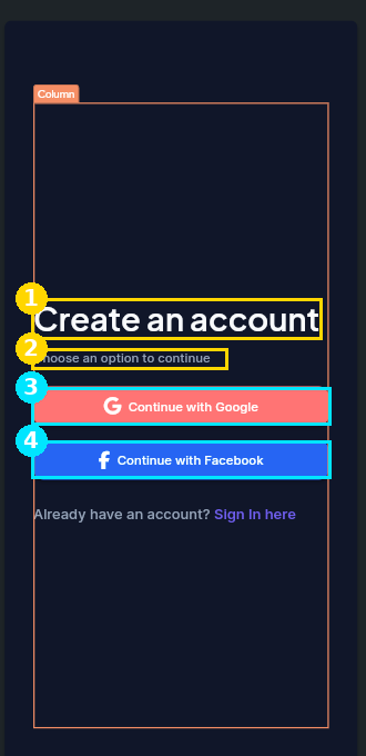
Numbered callouts on a FlutterFlow screen: (1) a Text widget used as a heading, (2) a Text widget used as a subtitle, (3) and (4) Button widgets with icon and label
Text
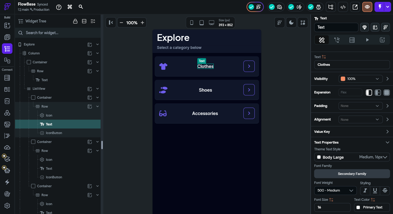
The Text widget displays a string of text on screen. It is the most fundamental widget in any app — nearly every screen contains at least one.
📋 Steps to Follow
1. Drag a Text widget from the Base Elements panel onto your page canvas.
2. With the widget selected, open the Properties panel on the right.
3. Tap the Value field and type the text you want to display.
4. Scroll to the Font section and choose a Font Family from the list.
5. Set the Font Size (try 20 for a heading) and pick a Font Weight such as Bold.
6. Choose a Text Color and set the Alignment (e.g., Center) to match your design.
Text — Key Properties
Value: The string of text to display. This can be static (typed directly) or dynamic (bound to a variable or database field).
Font Family: Choose from Google Fonts or custom uploaded fonts.
Font Size: In points. Common sizes: 12–14 for body text, 18–24 for headings, 28+ for display titles.
Font Weight: Thin, Light, Regular, Medium, Semi-Bold, Bold, Extra-Bold, Black.
Color: Any solid colour or gradient.
Text Alignment: Left, Center, Right, or Justify.
Max Lines: Limit how many lines the text can span. Combined with Text Overflow, you can add ellipsis (...) for truncation.
Letter Spacing / Line Height: Fine-tune spacing between characters and lines.
Image
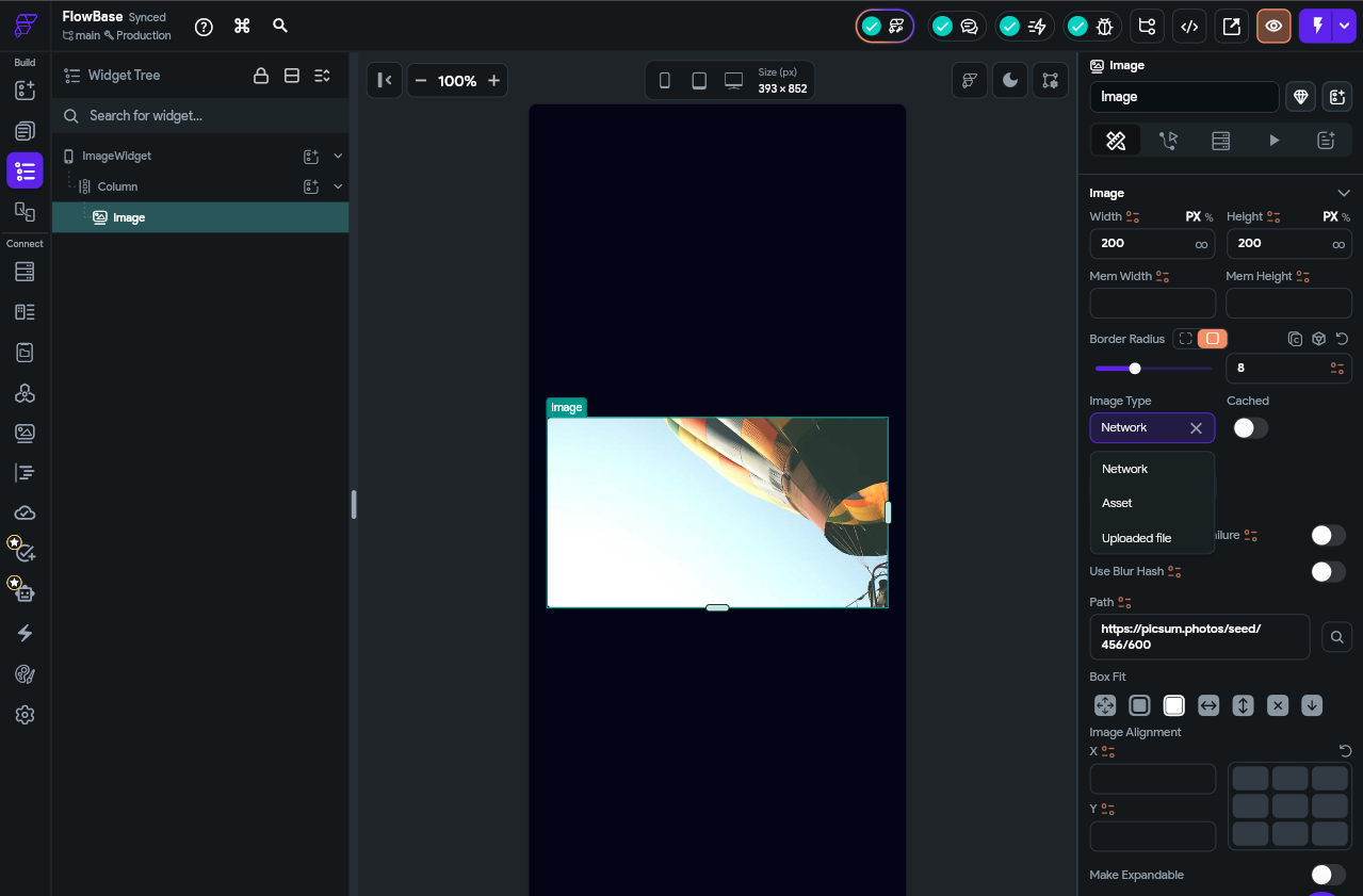
The Image widget displays a picture. Images can be loaded from three sources: uploaded asset files, a network URL, or a user-uploaded file stored in Firebase Storage.
📋 Steps to Follow
1. Drag an Image widget onto your canvas from the Base Elements panel.
2. Open the Properties panel and locate the Source section.
3. Choose a source tab: Asset (upload a file), Network (paste an image URL), or Uploaded File.
4. If using Network, paste a valid image URL and confirm the preview loads on the canvas.
5. Set Width and Height, then choose a Box Fit option such as Cover.
6. Optionally set a Border Radius and a Placeholder image for slow network loads.
Image — Key Properties
Source: Asset (image file you upload to FlutterFlow), Network (a URL pointing to an image on the web), or Uploaded File (dynamic images stored by your users).
Box Fit: Controls how the image fills its container. 'Cover' fills the space and crops if needed. 'Contain' shows the full image with empty space. 'Fill' stretches to fill (can distort).
Border Radius: Round the corners of the image — useful for circular profile pictures (set all four corners to 999).
Width / Height: Constrain the image dimensions.
Placeholder: An image or icon shown while the real image is loading from the network.
Icon
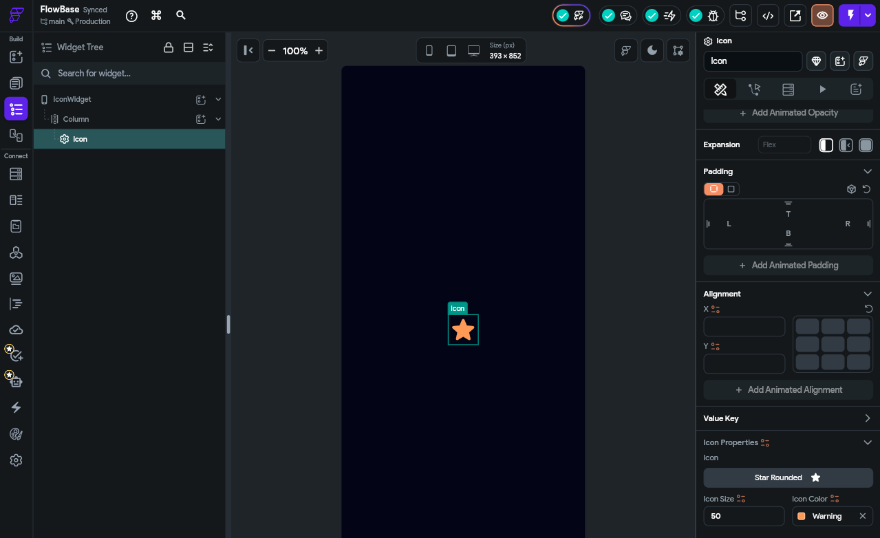
The Icon widget displays a single icon from an icon library. Icons are vector-based (they scale perfectly to any size without blurring) and are a cornerstone of intuitive UI design.
📋 Steps to Follow
1. Drag an Icon widget onto your canvas.
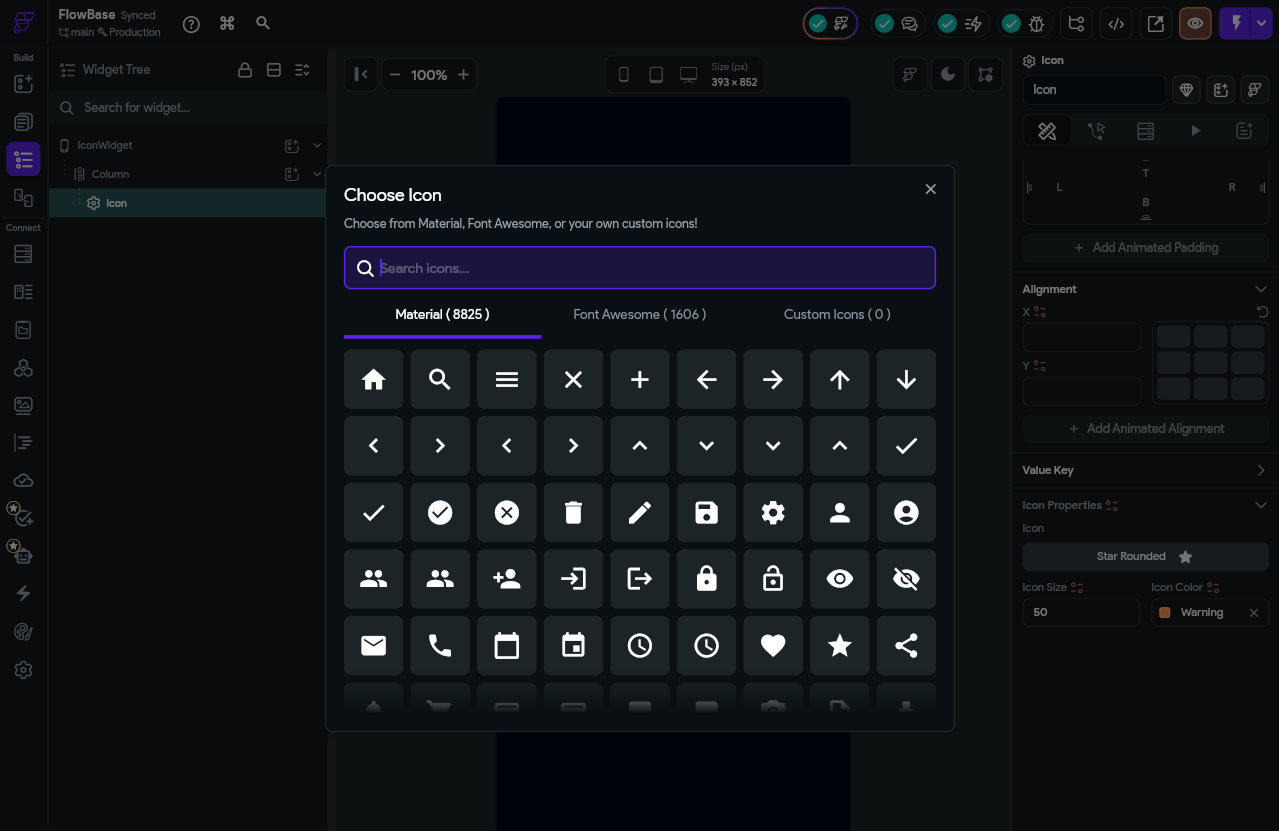
2. Tap the icon preview to open the icon picker.
3. Use the search box to find an icon (e.g., type “favorite”).
4. Select an icon from the Material Icons, Font Awesome, or Custom set.
5. In the Properties panel, set the Size (e.g., 32) and Color (e.g., red) of the icon.
Icon — Key Properties
Icon: Search and select from Material Icons (built into Flutter), Font Awesome, or custom SVG icons you upload.
Size: Icon diameter in points.
Color: The fill colour of the icon.
Button
The Button widget is an interactive element that triggers an action when tapped. Buttons are how users communicate intent to your app — "Submit this form," "Go to the next page," "Add to cart."
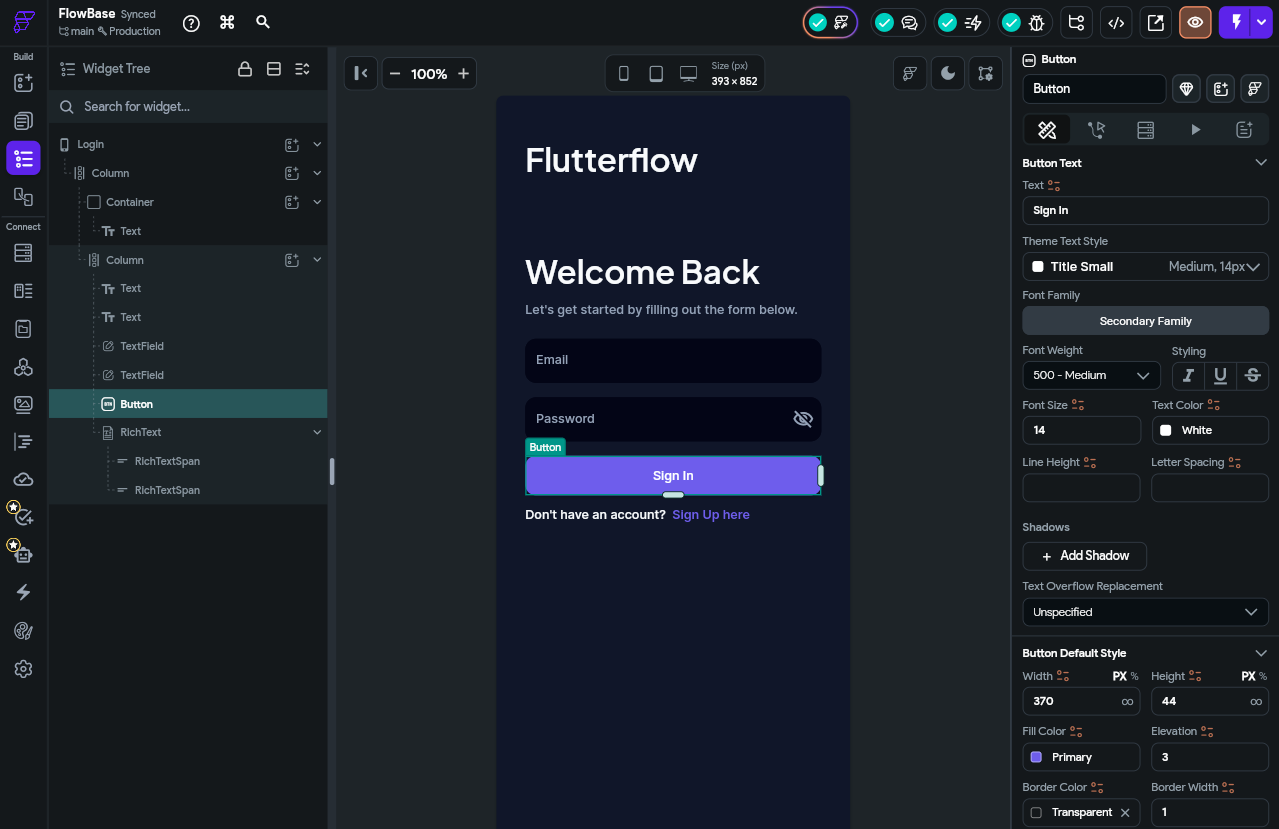
📋 Steps to Follow
1. Drag a Button widget onto your canvas.
2. In the Properties panel, set the button's Text label.
3. Customize the Background Color, Text Color, and Border Radius to match your design.
4. Switch to the Actions tab (lightning bolt icon) for this widget.
5. Tap the + button to add an action, e.g., choose “Navigate to Page” and select a destination page.
6. Preview the page and tap the button to confirm the action fires correctly.
Button — Key Properties
Text: The label displayed on the button.
Icon (optional): An icon placed to the left or right of the button text.
Background Color: The button fill colour.
Text Color: The colour of the button label.
Border Radius: Round the corners.
Width / Height: Size of the tappable area.
Rich Text
Rich Text is a more advanced version of the Text widget that lets you combine multiple text styles within a single block. For example, a sentence where one word is bold and another is a different colour — without needing two separate Text widgets.
When to use it: "By signing up you agree to our Terms of Service" — where 'Terms of Service' is a different colour and acts as a hyperlink. Or mixing regular and bold text in a single sentence.
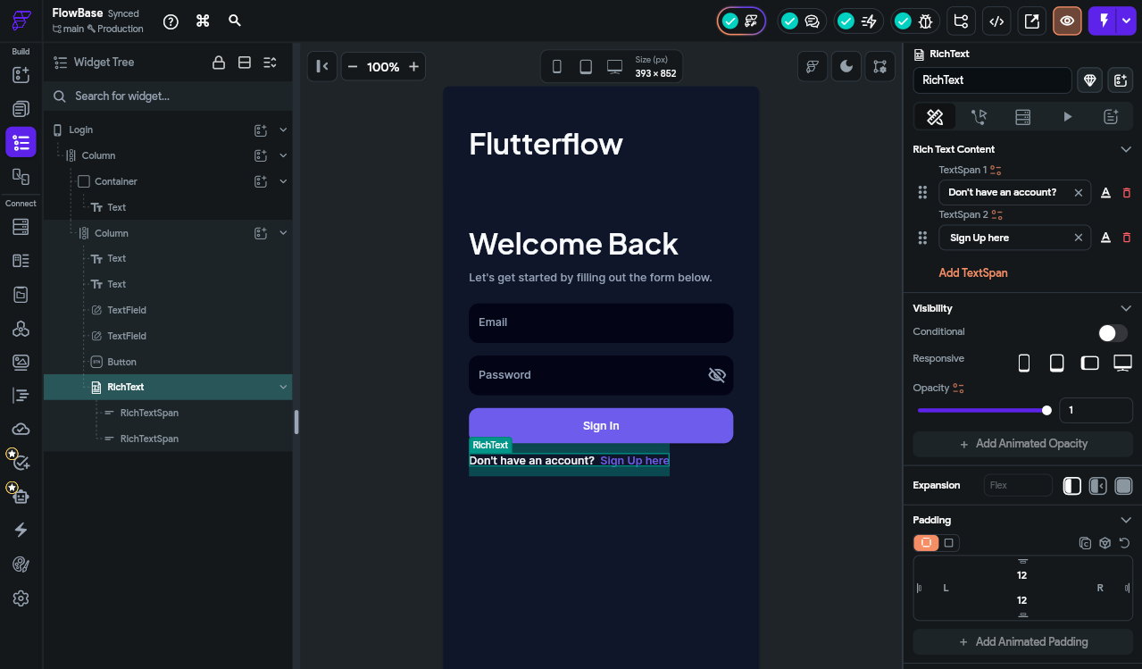
Numbered callouts showing a Rich Text widget with two spans: (1) the regular-weight grey text span, and (2) the styled, coloured link-like span
Category 3: Page Elements
Page elements are structural widgets that live outside your main content area. They define the frame or chrome of a page — the top bar, bottom bar, navigation drawer, and floating buttons. These widgets are added at the page scaffold level, not inside your widget tree.
🔑 Key Concept
The Page Scaffold: Every FlutterFlow page has an invisible scaffold that holds Page Elements. The scaffold is like the skeleton of the page — the AppBar sits at the top, the body content fills the middle, the BottomNavBar sits at the bottom, and FABs float on top.
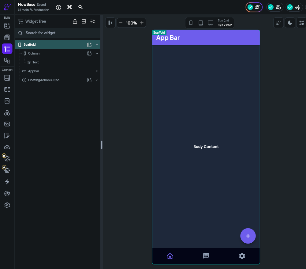
AppBar
The AppBar is the horizontal bar that appears at the top of the screen. It typically shows the page title and provides navigation controls like a back button or a menu icon.
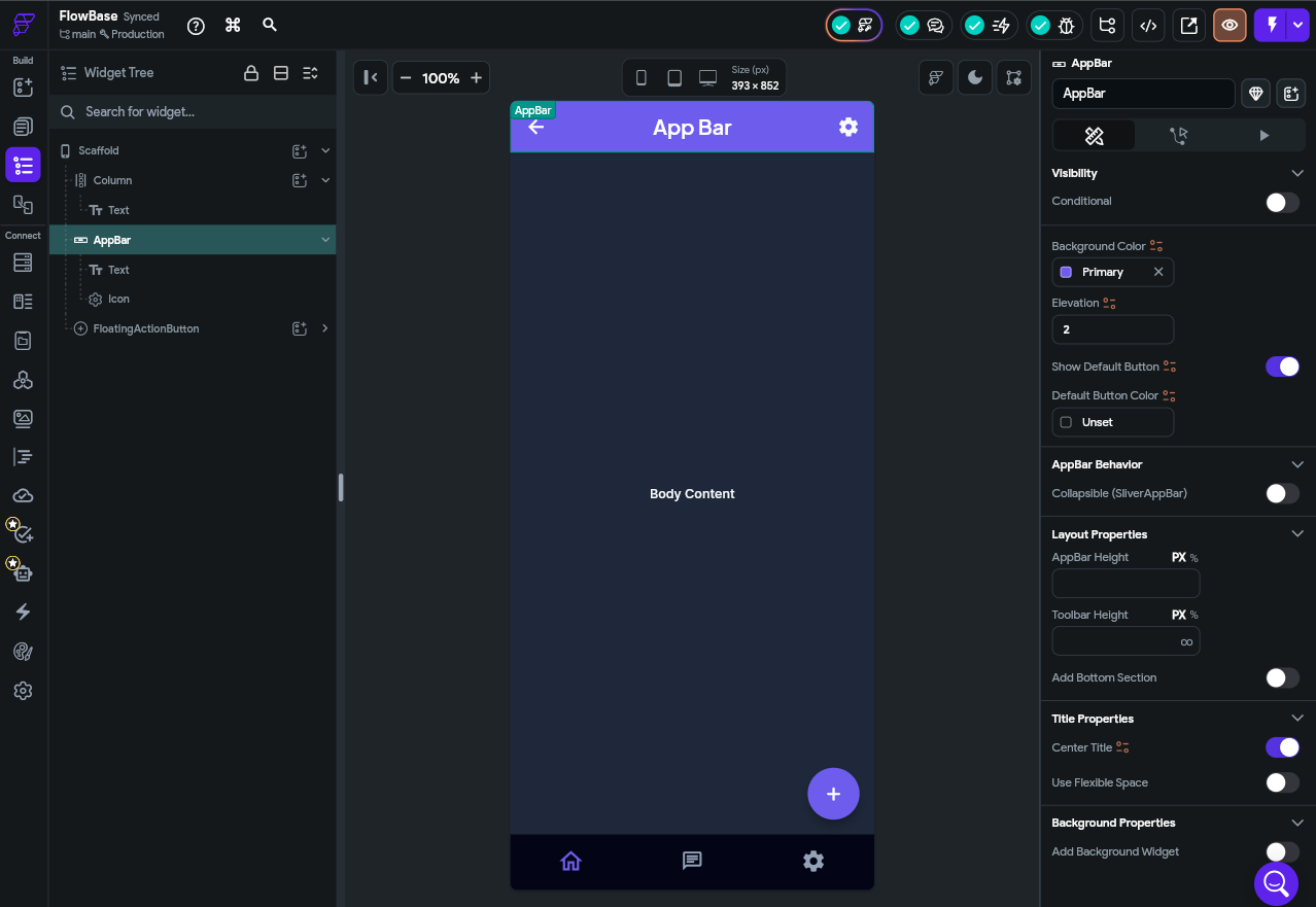
📋 Steps to Follow
1. Open a page and select the AppBar at the top of the canvas (or enable it in the page settings if hidden).
2. In the Properties panel, set the Title text for this page.
3. Configure the Leading widget (e.g., a menu icon to open a Drawer, or leave the default back arrow).
4. Add Action icons on the right by tapping + under the Actions section.
5. Set the Background Color and Elevation (try 0 for a flat look).
6. Preview the page to confirm the AppBar appears correctly across devices.
AppBar — Key Properties
Title: The text displayed in the centre (or left) of the AppBar.
Leading: The widget on the far left — usually a back arrow (auto-added on sub-pages) or a hamburger menu icon.
Actions: Widgets on the far right — commonly icon buttons for search, notifications, or settings.
Background Color: The colour of the AppBar bar.
Elevation: Shadow beneath the AppBar. Set to 0 for a flat, modern look.
Show Back Button: FlutterFlow automatically adds a back button on child pages — you can show or hide it here.
NavBar (Bottom Navigation Bar)
The NavBar is a persistent horizontal bar fixed to the bottom of the screen. It shows icons (and optional labels) for the app's main sections, letting users switch between them with one tap.
When to use it: Apps with 2–5 top-level destinations. Social apps (Home / Search / Notifications / Profile), e-commerce apps (Browse / Cart / Orders / Account).
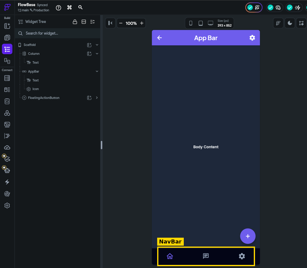
The highlighted NavBar fixed to the bottom of the screen, with three icon-and-label items for switching between main sections
📋 Steps to Follow
1. Open Project Settings and locate the NavBar & App Bar configuration section.
2. Enable the Show Navigation Bar switch for your app.
3. Go back to your App screen and select the scaffold widget to enable the “Show on Nav bar” switch to add the current screen to the navbar. You must have this enabled on 2 pages to display the navbar
4. For each screen, you can select the Icon and change its properties.
5. You can set the Active Colour and Inactive Color to match your theme from settings.
NavBar — Key Properties
Nav Items: Each item has an Icon, an Active Icon (icon when selected), and a Label.
Active Color: The colour of the selected item.
Inactive Color: The colour of unselected items.
Background Color: The bar's background.
Show Labels: Toggle whether text labels appear below icons.
🔑 Key Concept
In FlutterFlow, the NavBar is configured at the page level and automatically handles navigation between the pages you assign to each item. You do not need to set up manual navigation actions for NavBar items.
Category 4: Form Elements
Form elements are widgets that collect input from the user. Every app that has a login screen, a sign-up flow, a search bar, or a settings page will use form elements. They are the primary way users communicate data back to your app.
📝 Note
In FlutterFlow, you typically group form elements inside a Form widget or a Column. The Form widget provides built-in validation — it can check that all required fields are filled before the user submits.
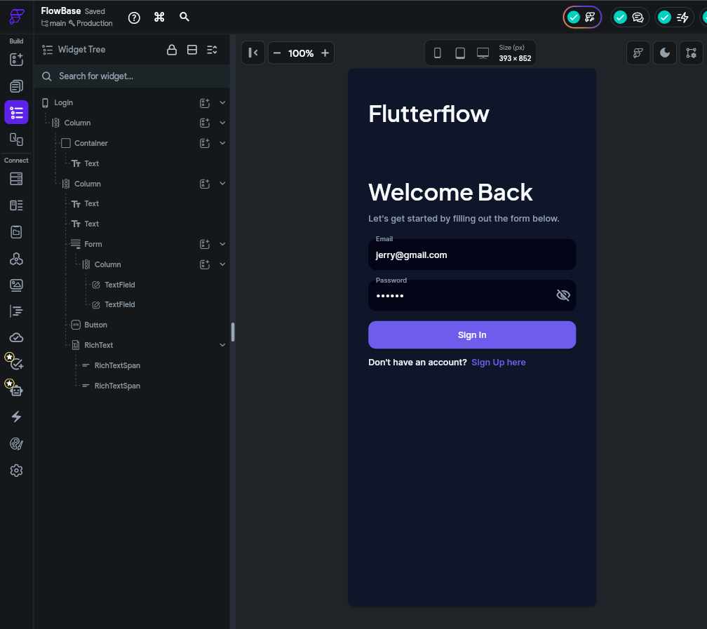
TextField
The TextField widget allows the user to type text using their device keyboard. It is the most important form element — used for usernames, emails, passwords, search queries, messages, and any free-form text input.
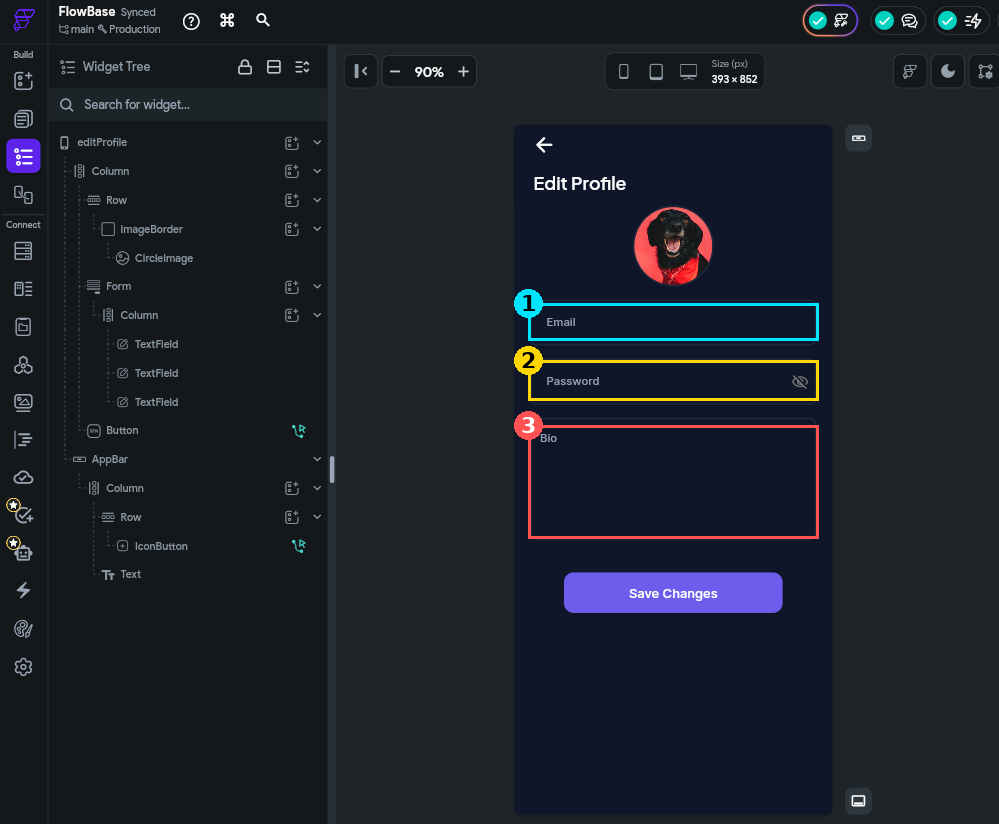
Numbered callouts on the Edit Profile screen: (1) the Email TextField, (2) the Password TextField with the obscure-text eye icon, and (3) a multi-line Bio TextField (Max Lines greater than 1)
📋 Steps to Follow
1. Drag a TextField widget onto your canvas, ideally inside a Column.
2. In the Properties panel, set the Label Text (e.g., “Email”) and Hint Text.
3. Set the Keyboard Type to match the input — choose “Email Address” for an email field.
4. For a password field, add a second TextField, set Label Text to “Password”, and enable the password field option from the additional properties section.
TextField — Key Properties
Label Text: Placeholder text that floats above the field when focused.
Hint Text: Ghost text shown inside the empty field to guide the user.
Keyboard Type: Changes the on-screen keyboard — Text (default), Email Address, Number, Phone, URL, etc.
Max Lines: Set to 1 for a single-line field or higher for a multi-line text area.
Leading / Trailling Icon: An icon inside the field — a magnifying glass for search, an email icon for email fields.
Checkbox
A Checkbox is a small square that the user can tap to toggle between checked (true) and unchecked (false). It is used for binary yes/no choices.
When to use it: Agree to terms and conditions, subscribe to newsletter, mark a task as complete, toggle a preference on/off.
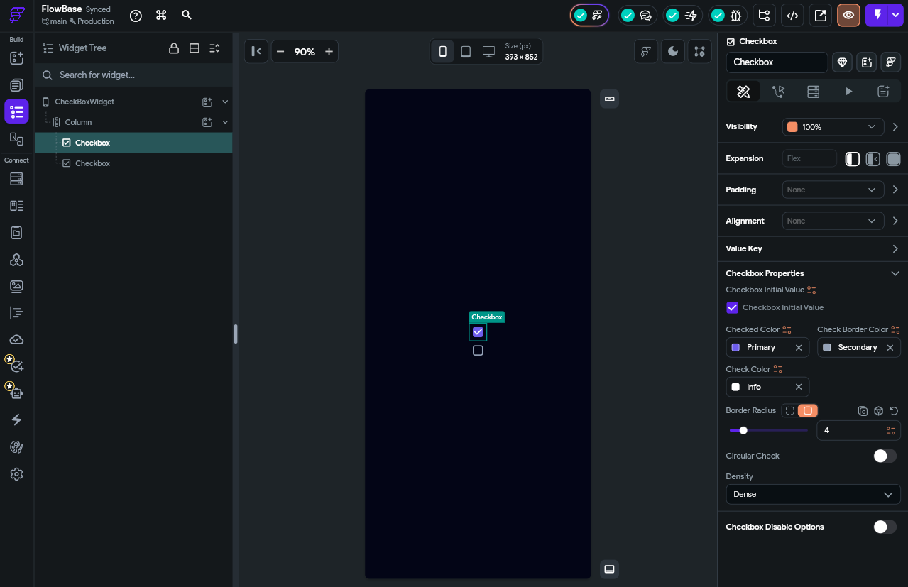
📋 Steps to Follow
1. Drag a Checkbox widget onto your canvas, inside a Row alongside a Text widget for the label.
2. In the Properties panel, set the Initial Value (checked or unchecked).
3. Set the Active Color (the fill colour when checked) and Check Color.
4. Type a label such as “I agree to the Terms of Service” in the adjacent Text widget.
5. Open the Actions tab and add an On Changed action to update a boolean state variable.
6. Preview the page and tap the checkbox to confirm it toggles between checked and unchecked.
Checkbox — Key Properties
Initial Value: Whether the checkbox starts checked or unchecked.
Active Color: The fill colour when checked.
Check Color: The colour of the checkmark inside.
On Changed Action: What happens when the user taps the checkbox — usually updating a boolean state variable.
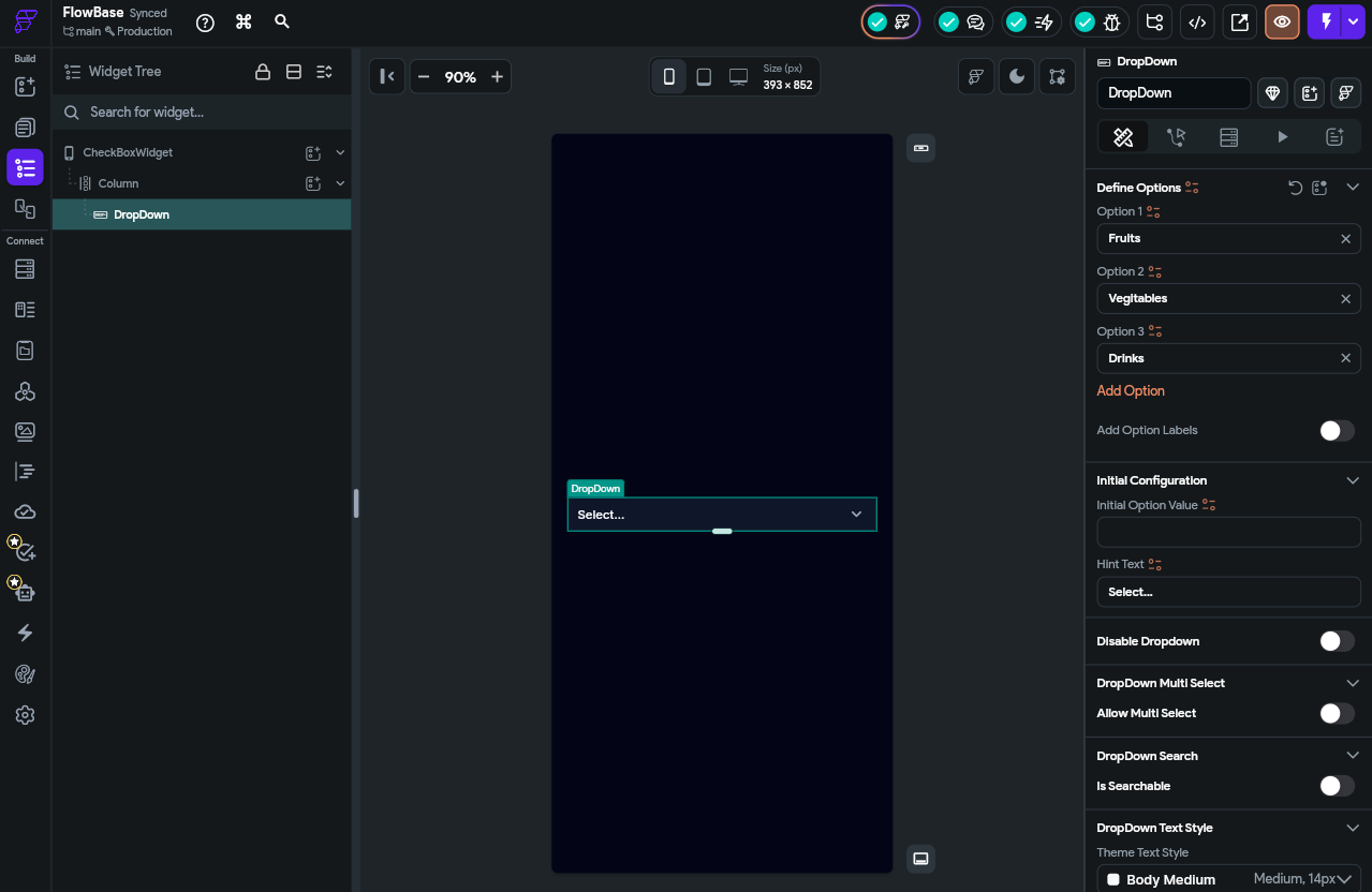
Dropdown
A Dropdown lets the user select one option from a hidden list that appears when they tap the widget. It conserves screen space by hiding all options until needed.
When to use it: Country selection, category filters, language preference, any list with more than 4-5 options where Radio Buttons would take too much space.
📋 Steps to Follow
1. Drag a Dropdown widget onto your canvas.
2. In the Properties panel, add the list of Options (e.g., a list of countries).
3. Set the Hint Text (e.g., “Select your country”) shown before a value is chosen.
4. Optionally set an Initial Option to pre-select a value.
5. Add an On Changed action to capture the selected value into a state variable.
6. Preview the page, tap the dropdown to open it, and select an option to confirm it updates.
Dropdown — Key Properties
Options: The list of choices. Can be a static list you type in, or a dynamic list from your database.
Initial Option: The value selected before the user interacts.
Hint Text: Text shown when no value is selected yet (e.g., 'Select your country').
Icon: The dropdown arrow icon.
On Changed Action: Triggered when the user selects a new option.
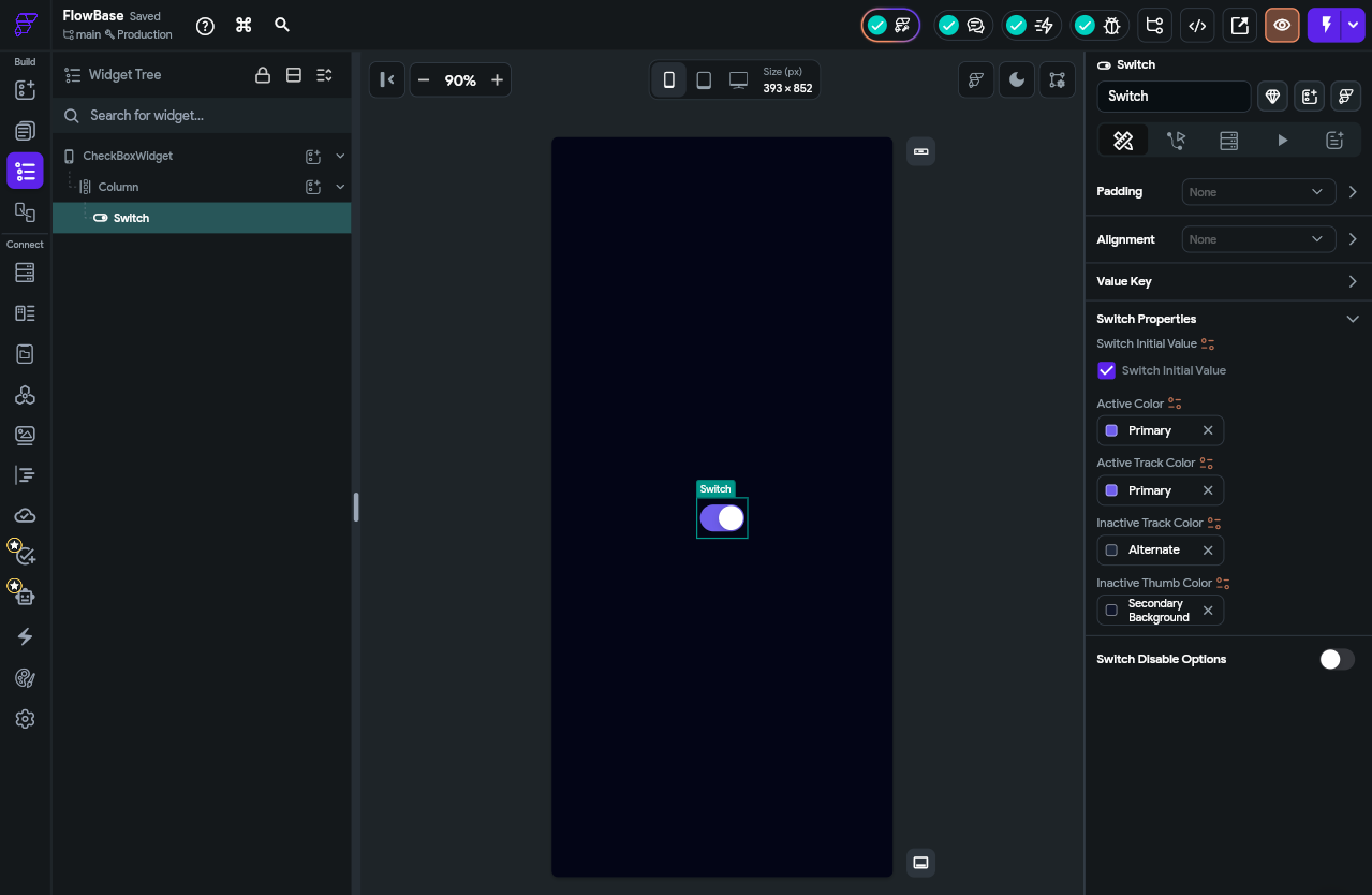
Toggle (Switch)
A Toggle (or Switch) is a sliding on/off control — functionally identical to a Checkbox but with a different visual language. Toggles feel more natural for settings that take effect immediately.
When to use it: Dark mode on/off, push notifications on/off, location access on/off — any setting that has an immediate, reversible effect.
📋 Steps to Follow
1. Drag a Toggle (Switch) widget onto your canvas, next to a Text label such as “Enable Notifications”.
2. In the Properties panel, set the Initial Value (on or off).
3. Customize the active (on) and inactive (off) colours to match your theme.
4. Add an On Changed action to update a boolean state variable when the toggle is flipped.
5. Preview the page and tap the toggle to confirm it switches between ON and OFF states.
🔑 Key Concept
Toggle vs Checkbox: Both represent a boolean (true/false). Use a Toggle for settings that take immediate effect — users associate the sliding motion with 'activating' something. Use a Checkbox for forms where the user is making a choice that is only acted upon when they submit.
Practical Tips
Before you close this guide and open FlutterFlow, here are the most important lessons from experienced FlutterFlow developers:
1. Master the Five Core Widgets First
Everything else builds on these. Before exploring advanced widgets, become comfortable with:
- Container — Your primary styling tool.
- Text — Your primary display tool.
- Icon — Your visual communication shorthand.
- Button — Your primary interaction tool.
- Image — Your primary media tool.
2. Think in Rows, Columns, and Containers
Almost every app layout can be broken down into a hierarchy of Rows, Columns, and Containers. When you look at any app on your phone, try mentally decomposing it: 'This is a Column containing a Row (for the header), then a ListView (for the content).'
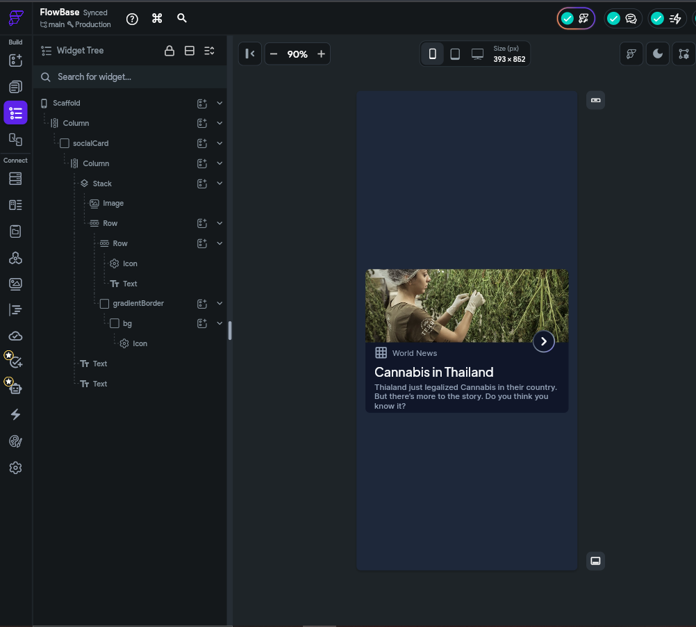
3. Build Components Early
The moment you copy and paste the same widget combination twice, stop and turn it into a Component instead. This habit saves hours of work and prevents inconsistencies.
4. Use Theme Colours and Fonts
Never hard-code a colour like #0097A7 directly on a widget. Always use a theme colour. If you later need to change your brand colour, you change one setting instead of hunting through 100 widgets.
5. Use Stack Sparingly
Stack is powerful but can make layouts hard to maintain. Only use it when you genuinely need elements to overlap. For most layouts, Rows and Columns are clearer and easier to adjust.
6. Preview Often
FlutterFlow's Preview mode shows you exactly how your app will look and behave on a real device. Get into the habit of previewing after every significant change — it is far easier to catch layout problems early.
🚀 Try It Yourself
Challenge: Open FlutterFlow and build a simple Profile Card from scratch. It should contain:
• A circular profile Image
• A Text widget for the user's name (bold, 20pt)
• A Text widget for the user's title/bio (regular, 14pt, grey)
• A Row of three icon buttons: Message, Follow, Share
Wrap everything in a Container with a white background, rounded corners (radius 16), and a subtle shadow. Then convert the whole card into a Component.
What's Next?
You now have a solid overview of every widget category in FlutterFlow. The best way to cement this knowledge is to build something real. Here is a suggested learning path:
- Build a static profile page using Container, Column, Row, Image, Text, and Icon.
- Add a Button that navigates to a second page.
- Build a login form using TextFields, a Checkbox (remember me), and a submit Button.
- Create a scrollable list using ListView with at least five items.
- Turn a repeated widget into a Component and use it in multiple places.
- Apply a consistent theme — set brand colours and fonts globally.
What are widgets in FlutterFlow?
Widgets are the building blocks of every FlutterFlow app. Every element you see on a screen, including text, buttons, images, forms, and layouts, is a widget that helps create the user interface.
Why are widgets important in FlutterFlow?
Widgets determine how your app looks and behaves. By combining different widgets, you can build complete user interfaces without writing extensive Flutter code.
What are the four widget categories in FlutterFlow?
FlutterFlow organizes widgets into four categories:
- Layout Elements
- Base Elements
- Page Elements
- Form Elements
What is the difference between Row and Column in FlutterFlow?
A Row arranges widgets horizontally from left to right, while a Column stacks widgets vertically from top to bottom. Both are essential layout widgets for building responsive interfaces.
What is a Container widget in FlutterFlow?
A Container is a versatile widget used to style other widgets. It lets you add padding, margins, borders, rounded corners, shadows, background colors, and size constraints.
What is the difference between ListView and GridView?
ListView displays items in a scrollable vertical or horizontal list, while GridView arranges items in a two-dimensional grid, making it ideal for galleries, product listings, and image collections.
Which FlutterFlow widgets should beginners learn first?
Beginners should start with:
- Container
- Text
- Button
- Image
- Icon
- Row
- Column
These widgets form the foundation of nearly every FlutterFlow application.
What are Form Elements in FlutterFlow?
Form Elements collect user input. Common examples include TextField, Checkbox, Dropdown, and Toggle widgets, which are used in login pages, registration forms, and settings screens.
Can you build an entire app using FlutterFlow widgets?
Yes. Every screen, layout, interaction, and user interface component in FlutterFlow is created using widgets. By combining them, you can build complete mobile and web applications without traditional coding.
How do FlutterFlow widgets compare to Flutter widgets?
FlutterFlow uses the same underlying Flutter widget system but provides a visual drag-and-drop interface. This allows developers and beginners to build Flutter applications faster while still generating production-ready Flutter code.
.svg)
.svg)


.avif)
